PART 4
I’m definitely past the “not wanting to work on my project” hump. Now, I can’t wait to get a chance to work on it.
Soon after I posted my last article, I remembered a website I bookmarked that might help me with my reference problem. I checked it out. Turns out I was right. It was exactly what I needed. It had both, good costumes and great character types. I spent my lunch hour downloading photos that I might be able use. That same night, I came home and began to sketch from them:

But then I thought to myself, maybe I should draw some silhouettes before I continue drawing faces. I went and got my copy of THE SKILLFUL HUNTSMAN, opened it to the silhouettes pages for inspiration.


The pages in the book where cool. I thought to myself, I could do that. I was wrong:

Wow, THAT didn’t go as planned. I rolled a critical miss on my “draw cool, well designed silhouette” skill check. Doing them is waaay more difficult than I had anticipated. I thought I understood what I was doing but I guess not. Frustrated, I stopped for the night and decided to try something else the next day.
After reading my last post, Zach Bosteel suggested that I ought to look at actors Tilda Swinton and Steve Buscemi for inspiration for character types. He was dead on. I thought they might actually work pretty well as Sorcerers. I started to sketch them:

My drawings didn’t quite capture their likeness but that wasn’t the point. I just wanted to capture their “type”. Still, I WAS trying to capture their likeness just as a personal challenge. Failed my “capture likeness” skill check too. You’d think with a face like Steve Buscemi’s I’d be able to draw him easier. Tilda Swinton, is just a pain to draw since she’s so plain. I’m just really bad a caricatures I guess. I need to practice it much more. I got what I wanted though, so I kept on going.
I then went into my photo reference and began mixing and matching a little. These are the photos I used:


My first thought (Groups 1 below) was to take the Steve Buscemi type and give him crazy hair while combining the vest from the guy (in the second photo above), the long haired guy’s pants (from the third photo above) and the happy guy’s shoes (from the first photo). In the end, I didn’t like it one bit. I then used jawbone boy’s face (the last picture above) and put it on that body (Drawing 2 below). It worked better but I still wasn’t happy.:

I gave that up and tried a different direction. I used the photo below and drew the guy on the left, pretty much, straight out for drawing 3 (above):

I liked it. I thought I could use that design as the second male Sorcerer. I thought it would be funny to give that guy a Steve Buscemi type face which would be the reason why wares his hair down over it.
A few days later I looked at some more photos and picked these:


I took the guy on the top right and tried drawing him (drawing 1 below). I thought it was funny since the guy looks like a rejected Duran Duran band member. I then thought I’d try something I’d been thinking about for a while and tried drawing jawbone boy with a hoodie (second photo above) (Drawing 2 below). I didn’t like it so I tried drawing the Duran Duran guy again using different shapes which I liked (Drawing 3 below). I then skipped back to the other design idea and tried to make the collar work (Drawings 4 below) but it just made him look like an astronaut or something:

So far I’m leaning more in the direction of the Duran Duran guy. I kinda like the idea for some reason. It makes me laugh. I also like the jawbone boy’s face thought. Either way, I’m getting closer to what I’m going to end up using.
PART 5
I continued to explore the characters this week, trying to find the right face and shape for the Duran Duran Sorcerer:

I made up my mind fairly quickly (maybe too quickly) with the look I was going to go with for the Sorceress. Which used this picture as reference:


I then decided to focus specifically on the silhouettes of the characters:

The “final” silhouettes I placed at the top of the page below. I put quotes on the word final because I’m still giving myself a little bit of leeway to adjust them if I need to, or get rid of them all together (I’m not 100% sure about the Sorceress yet, I might be rushing her). I’m the most happy with Rob’s silhouette.
I then decided to really start working out the details of the characters again. I decided to start with the lead Sorcerer’s face, since I felt I was close. I accidentally hit upon a design for his face that I REALLY like. It’s not a solidly constructed drawing but it will do for now:

FINALLY! Two down, two more to go. After that, I have to design the backgrounds and the monsters. Plus test the flat stylized look I’m going to want to use, which means, doing an animation test.
So far all this has been fun and frustrating all at the same time. After so many bad designs, it feels good when you hit one you like.
PART 6
I developed the Sorceress a little bit more. Decided on a face and refined the shapes a bit more to my liking:
PART 7
(At the time I wrote the following part, the World Cup was going on and I was watching it):
The World Cup is still effecting how much I get done on my project. I did manage to, at least, draw a page. It hasn’t helped that I didn’t have a hard copy of my photo reference, until yesterday. If I had, I probably would have done a bit more. At this point I’m pretty happy with where the designs are. I might do a few more sketches but I need to move on to design the backgrounds. Which might turn out to be interesting. I might need to go around and take pictures of places to use as reference. I’ll have to “location scout”. Find a good place where a magickal fight can take place. A place with good obstacles that can be destroyed. Most likely, I’ll find a few places and mix them all up together.
Anyway, here’s what I did this week:

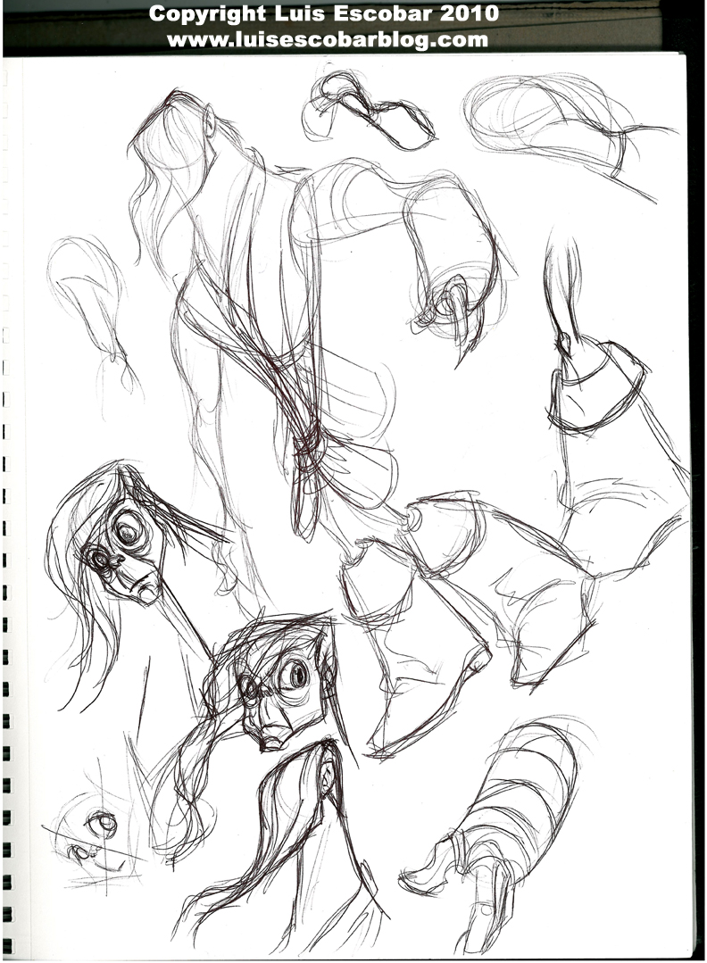
I definitely need to work out more of the detail in this character. I’ve decided to give all the Sorcerers long pupils as apposed to round ones. Makes them look a little less human.
PART 8
Okay, so this page of drawings was just drawn to have something to post up. I did some adjusting on the Sorceress’ face so that it was a bit more stylized. I also drew out her face so I could, at least, see what she looked like. I straighten out her skirt so it wasn’t so girly, and I worked out a bit of the arm detail of the long haired Sorcerer’s arm:

On Monday, my wife got invited to a get together with some friends from her work and the whole family went. At one point during the evening I did my typical anti-social thing and began drawing in a corner. I decided that I was going to try to draw Steve Buscemi from a photo. I pulled a picture up on my phone and began to draw it. The reason I did this was, since I was using him as inspiration, I thought it wouldn’t hurt to just try to capture his likeness “for real” in case I could apply what I learned from doing so to my design. So this is what I drew:

Red color pencil under drawing, inked with a Pentel brush pen. I used 2 Copic neutral grey markers and a black one for tone with a Whiteout pen for highlights. It came out okay but I think if I drew a few more I would eventually “be right on”. I think, had you not known it was him, you would find that it looks familiar but you couldn’t put you’re finger on who he was suppose to be. At least it was fun to do and it’s WAY better than my other attempts.
So did I learn anything for having drawn the above drawing? I have no idea.
I definitely want to start on the backgrounds now. I’m going to see if I can find some time this weekend to go out and “location scout”. It’s possible I won’t be able to though, since I have a wedding to go to this Saturday two hours away.
I’m still not sure where exactly my story should take place. At first I thought it should take place outside a Wienerschnitzel type place. Then I was thinking that it might be better if it’s takes place in front of a portable hot dog stand. If that’s the case, the story can take place, just about anywhere. Thing is, I want Rob (the protagonist) to sit down on a bench to eat. Then again, he could sit on a wall or…well just about anywhere. So where should this take place? A park? A street corner? I want obstacles and things to destroy so that at the end we just see the smoldering ruin of the area they just fought in. Also, it would be nice to have some “natural” obstacles so that it’s more difficult for Rob to get away. Any ideas?
If I don’t manage to get any photo reference, I’ll try doing a “style test” with all the characters. Basically I’ll just do a finished drawing with all of them in a picture, possibly in color.


