Luis' Illustrated Blog

Simpsons Storyboard artist. Artist and storyteller. Exploring how to make a living, by being creative.
  • About me
  • Art, Stories & Comics by me
    • Illustrated trip to Italy
    • Superhero Versus Superhero
    • The Black Terror Kid #1
    • The Black Terror Kid #2
    • The Seven Impossible Tasks
  • Supporters
  • Making my Illustrated Film.
    • 04 Juggling overlapping art decisions
    • 05 Designing environments
    • 06 Composition and Design principles
    • 07 Why design from reality
    • 08 Adding tone to a thumbnail sketch
    • 09 From thumbnail to final line
    • 10 Tone, how to add it
    • 11 Finalizing and coloring a concept drawing
    • 12 Struggling: Finding the right poses.
    • 13 Coloring poses
    • 14 The teaser trailer
    • 15 Story Theory and throughlines
    • 01 Story concept and rough outline
    • 02 Finding a style
    • 03 Designing Antagonists
  • Shop
  • Checkout
  • My Account
  • Cart

You are browsing the Blog for ART

Selling Your Art: Diversifying What You Sell

March 12, 2015 in ART

ART – Selling Your Art: Diversifying What You Sell

Batman vs. Spider-Man color

 Why Diversify?

As much as I still have to learn about painting, I’ve got to put that aside for the moment and turn to other projects.

The Month of May is going to be a busy month for me.  I’m going to have a table selling my books and art in two different venues that month.

Thing is, from past experience and from experiences my friends have had, I realized I need to diversify what I sell.

I have my books, but there are many people who would like to buy something from me but are unwilling to spend the money on those items or they’re simply not interested in them.

How I’m Doing It

For people like them, I needed something that is of greater interest and/or at a lower price point.

Turns out there’s a lot of people who really like my “versus” drawings.  So I thought, why not sell those?  I could make prints, magnets and postcards and those items could be at different price points.

Some would be less expensive and some more.  That way, anyone who wanted to get a little something, could.

Also, from the experiences my friends have had, putting prints up on their booths draws attention and makes it easier to see what you’ve got that they might like without anyone needing to approach your table.

Getting to Work

The only thing is, I never intended to make the versus drawings available for sale.  They were only meant for fun.

Some of them were never inked and all but one, didn’t have color.

This means that I now have to go back and ink the ones I need to ink, and color the rest.

That’s what I’m now doing.  Beginning with the drawing above of Batman vs. Spider-Man.

For the next few weeks, I’ll be posting the more “final” versions of my “versus” drawings.

Hopefully, I can learn a thing or two about color in the process.


Share this:

  • Share
  • Click to share on Facebook (Opens in new window)
  • Click to share on Twitter (Opens in new window)
  • Click to share on Pinterest (Opens in new window)
  • Click to share on Tumblr (Opens in new window)
  • Click to share on Reddit (Opens in new window)

Like this:

Like Loading...

Comments Off on Selling Your Art: Diversifying What You Sell

Painting Learning Moment: Knowing When to Walk Away From an Unfinished Work.

March 5, 2015 in ART

Art – Painting Learning Moment: Knowing When to Walk Away From an Unfinished Work.

In my last post, I set up the line work of the painting I was going to work on.

I also wrote that, if I messed up the painting, I would simply stop working on it and move on.  Well, turns out I’m going to be moving on.

Not because I think I messed up but because something else came up, that needs my time more.  I’ll write about it next week.

That said, it didn’t help that I’m also in the process of writing another drawing book which takes up a lot of my painting time.  I really didn’t get to put in the time on the painting that I wanted to.

In any case, let me share with you what happened, and a few tips about what you should take away when you walk away from an unfinished work.

Applying What I Learned

Since I was done with the line work and since I had already spent a lot of time with a painting that didn’t work, which looked like this:

Supergirl Painting failed second pass

I thought I’d combine the two.

Taking the line work I had done, which looked like this:

Supergirl shadow guide

I put it on top of a copy of the painting that didn’t work.  I used a copy in case I needed the original for whatever reason.

I then sampled the colors of the copy and proceed to apply the colors within my line work.  It was a lot like coloring in a coloring book.  I stuck mostly to the darkest areas of the painting.  I rarely touched the light side.

Although it doesn’t like like it.  Mostly because I had done so much work on the light already.

Here’s what it looked like:

Supergirl Heroic Second Attempt First pass

It looked much better even at this stage than the other one.

I didn’t put any details in the shadow areas and just kept them as one mass shape.

So I can now pat myself on the back for successfully applying step two…or is it three? Since the drawing should also be a step…

Anyway, I thought I’d start doing the next step.  Thing is, I didn’t quite know what that step was.  So I made it up. I thought I’d finish the eyes and nose.

After I began working on that, my painting took a turn for the worse.  I ended up with a bug eyed monster. Take a look:

Supergirl bug eyes

Yeah, the eyes are just wrong.  They stuck out and looked unnatural. I think the colors I used where too bright. Also, It thing I drew the eyes too big.

It didn’t help that the nose was giving me trouble as well and I couldn’t quite get it to look right.

This was frustrating.  This is as far as I had gotten before I had to stop and work on my drawing book, but I didn’t want to leave the painting there if I was going to write about it on this blog post so I thought I’d try a desperate thing.

A few days later, I took the eyes from my original failed painting and pasted them onto this painting.  Then I blended them in as best as I could.  Here’s how it came out:

Supergirl Heroic slightly better

I was surprised it actually improved the face.  Those eyes where nowhere near as colorful or as big.

After that, I touched up the face a little more and stopped.

With more time I suppose I could make the painting actually look good, but I just don’t have the time.

I learned a lot, but it looks like I have to abandon this work and move on. At least I’m leaving the painting feeling like it isn’t a disaster.

Perhaps once I get better, I can come back and finish this up.

I doubt it though.  It’s better to just keep moving forward.

What to Walk Away With

The best way to walk away from a drawing or painting that didn’t turn out the way you wanted, is to have learned what you need to work on next.

If you don’t see a plan of action for what you need to study or try next, you haven’t been paying any attention to what you were doing.  And it’s possible you don’t even have a process at all.

You need to sit down and honestly analize what problems you where having when working on your drawing or painting.

Then break down those observations into a plan of action.

For example, here are my take aways and my plans of action.

Take Aways:

  • Beautiful women have less landmarks on their face than men. Their faces are smoother.  It’s more difficult to find anchors to work on. Because of this, their faces are more complicated to paint. I need to start on a simpler subject. Possibly men’s heads.
  • I’m not exactly sure I know I can do a finished digital painting yet.  I have yet to finish one.  I should therefore start simpler by taking away elements to worry about. I this case,  color. I should practice black and white paintings before going full color.
  • I obviously don’t have a full grasp on how to approach painting, eyes, noses and mouths. I need to practice painting these feature before I do my next full head painting.

Action Plans:

  • Practice painting noses. In black and white and in color.
  • Practice Painting eyes.  In black and white and in color.
  • Practice painting mouths. In black and white and in color
  • Paint male heads in black and white. Then in color
  • Eventually, paint another female head.

I hope you find these tips helpful.


Share this:

  • Share
  • Click to share on Facebook (Opens in new window)
  • Click to share on Twitter (Opens in new window)
  • Click to share on Pinterest (Opens in new window)
  • Click to share on Tumblr (Opens in new window)
  • Click to share on Reddit (Opens in new window)

Like this:

Like Loading...

1 Comment »

What Yoda Taught Me About Painting

February 26, 2015 in ART

ART – What Yoda Taught Me About Painting

What does that video above have to do with painting?

In my last painting post I wrote that I was going to count my loses and move on.  I fully intended to until I spoke to my friend Paul about my failed attempt.

I asked him what he thought my problem was. You know what he told me?

My head construction fundamentals where off. The basic principles of my head construction were not working.

Ouch.

That was the last thing I expected to hear. Once again, getting cocky failed me.

The reason I wasn’t able to get a handle on the painting was because the structure of my drawing was too nebulous.

After a conversation with him about drawing and painting heads, I came to the conclusion that I needed to work out and plan how I was going to paint my piece by drawing it first before painting it.

It turns out that the same technique I was using to paint in gouache, I could apply to my digital painting.

What technique? Click the links below to read the relevant posts on the subject:

  • Working on an episode without a Director. Finally a painting breakthrough! Tips on face rhythms, planes and tones.
  • Final cover painting. Marcelo Vignali interview

It’s ridiculous that I thought the process was different because I was painting in a different medium.

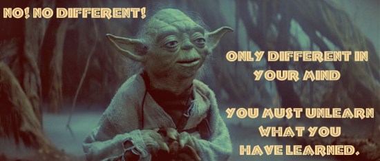
But as Yoda said to Luke:

No, no different, only different in your mind.

Photo courtesy of: http://quotespictures.net/18939/no-no-different-only-different-in-your-mind-yoda

So I’m doing it all again. Starting with a line drawing. So here’s what I’ve got so far:

Supergirl face rhythm guide

In the drawing above, I first started by constructing the head and then mapping the rhythms of the face.

Supergirl drawing the shadow guide

I then added a layer and using the rhythms, looked at my reference and worked out the shadow patterns.  I drew ONLY the darkest shadows.  I left out any light midtones.

This was the one thing I realized I was not thinking about when painting this piece the first time.  Separating the darkest shadows from the slight midtones in the light is key.

It can often be, the hardest part of the process and requires a ton of squinting.

What I ended up with is the drawing below:

Supergirl shadow guide

I will tell you this, doing the drawing first has shown me all the things I was ignoring and wasn’t thinking about when doing the painting.  I’m amazed that I neglected so much.  No wonder I lost control.

Trust the process. If you do it well, it will make everything easier.

The further down the drawing I got, the sloppier I got. That’s okay, I don’t really need the hands to be perfect, I’ll mostly be concentrating on the face. I may crop that area out in the final version.

This will be my final attempt. If I mess it up I’ll move on.  I’m getting tired of repainting this one piece. I need something new to get me excited again.

I also need a “win.” Perhaps, I’ll try something a tad less ambitious next time.

In a way, I already “won,” the process has taught me so much already. Still, I’d like a make a pretty painting at some point.

I’ll see how far I get by next week.

So yeah, I should have listened to Yoda from the start. I thought it was different, but it was only different in my mind.

Share this:

  • Share
  • Click to share on Facebook (Opens in new window)
  • Click to share on Twitter (Opens in new window)
  • Click to share on Pinterest (Opens in new window)
  • Click to share on Tumblr (Opens in new window)
  • Click to share on Reddit (Opens in new window)

Like this:

Like Loading...

Comments Off on What Yoda Taught Me About Painting

The Making of a Time Travel Anthology Cover

February 19, 2015 in ART

ART – The Making of a Time Travel Anthology Cover

I put my painting practice on hold this week to create a cover for a time travel anthology, Creative Alchemy Inc. will be publishing in a few months.

The book is called Masters of Time: A Sci-Fi and Fantansy Time Travel Anthology.

I spoke about the cover with my wife, who’s editing the book and also contributed to the collection of stories.  We both agreed we wanted a retro Science Fiction feel to the cover.  Something graphic simple.

I’m not a fan of photo covers.  I much prefer drawn or painted ones.  Also, there’s so many photo covers out there that a cover with artwork tends to stand out more.

My wife showed me a photo she thought had the feel she wanted and I went off from there. She wanted all the characters in the anthology to be represented in the cover.

The first thing I did was to sketch out a rough, to show her the direction I wanted to go.  Here it is below:

Masters of Time rough cover mock up

The intent was to show things in the cover that would immediately evoke the theme of the anthology at a glance. I thought it would be good to use time travel cliches and tropes to get this across. I decided to go with the characters coming out of a “time vortex,” in silhouette and I added clocks so you’d know it wasn’t just a portal.

She liked the concept, so I moved on to make the final cover. Unfortunately,  I didn’t record the process. It took about a week.

I used a lot of reference photos to get a real world idea of what I was going to abstract.  Then I began the tedious work of constructing the assets for the cover.

It was less like drawing and more like cutting out lots of different shapes out of colored paper and gluing it together.

Even though I’m still not sure about the fonts, the final art for the cover turned out like this:

Masters of Time Kindle Cover

Personally I think it turned out okay.

What do you think? Did I accomplish what I set out to do?

Share this:

  • Share
  • Click to share on Facebook (Opens in new window)
  • Click to share on Twitter (Opens in new window)
  • Click to share on Pinterest (Opens in new window)
  • Click to share on Tumblr (Opens in new window)
  • Click to share on Reddit (Opens in new window)

Like this:

Like Loading...

Comments Off on The Making of a Time Travel Anthology Cover

What to Do When Your Art Skills Fail You.

February 12, 2015 in ART

ART – What to Do When Your Art kills Fail You.

Supergirl Painting first pass

What do you do when your art skills fail you? Chalk it up to getting experience, move on and try again with another piece…and another…and another.

That’s the conclusion I came to, AGAIN.

It’s a simple lesson that’s so easily forgotten when you’re emotionally invested in the drawing or painting you’re trying to create. EVERY piece you make is a step forward.

You learn something from everyone you make.

Here’s what happened to me this time around. I got cocky.  I should have known better. Every time I get cocky, I fall on my face.

I’d been doing color studies for almost two Months now.  The more I did, the more comfortable I got with them.  They started to become second nature.  Which gave me confidence.

Too much confidence.

I thought to myself, “Hey, this stuff is so much easier now. Now that I’ve got this down, I could do a finished painting easy.”  I was sure I could do it.  After all, I could do step one easily.

Nope.

Problem was that I thought that getting step one down would make me automatically able to get the last step down as well.  Not realizing there were more steps along the way.

I didn’t realize there was a step two. Until step two kicked my butt.

I ended up with this painting I lost complete control of and didn’t know how to finish.

Supergirl Painting failed second pass

It’s time to chalk it up to experience.  Now I know what my limitations are and what I need to work on next.  Namely, step two.

That said, I’m going to ask my friend and mentor Paul Wee for some advice. Hopefully he can clarify for me what I can do to nail down step two. I’ll let you know.

Unfortunately, I have to take a small break from painting because I have a book cover for a time travel anthology to do.  Perhaps I’ll write about that next week.


Share this:

  • Share
  • Click to share on Facebook (Opens in new window)
  • Click to share on Twitter (Opens in new window)
  • Click to share on Pinterest (Opens in new window)
  • Click to share on Tumblr (Opens in new window)
  • Click to share on Reddit (Opens in new window)

Like this:

Like Loading...

Comments Off on What to Do When Your Art Skills Fail You.

Figure Drawing Painting Practice

February 5, 2015 in ART

ART – Figure Drawing Painting Practice

Figure Painting roughs 01

Figure Painting roughs 02

Figure Painting roughs 03

I figure draw every Tuesday night at work.  The studio provides us with the opportunity.

Since I’m trying to get better at opaque painting, I thought it would be good idea to practice it during figure drawing.  I used my  Samsung Galaxy Note 8.0 and the Sketchbook Pro App.

I don’t do this in color because it would be too much to think about.

The top painting it a two minute pose. The second one is five minutes, and the last one is ten minutes.  There isn’t much time to get a finished painting.  Just the impression of what you see.

Doing this made me very comfortable with laying in a figure fast.  I highly recommend it


Share this:

  • Share
  • Click to share on Facebook (Opens in new window)
  • Click to share on Twitter (Opens in new window)
  • Click to share on Pinterest (Opens in new window)
  • Click to share on Tumblr (Opens in new window)
  • Click to share on Reddit (Opens in new window)

Like this:

Like Loading...

Comments Off on Figure Drawing Painting Practice

Practicing Your Art Anywhere.

January 22, 2015 in ART

ART – Practicing Your Art Anywhere.

Lara Croft Digital color Study


The above color study was drawn on my Samsung Galaxy Note 8.0.  I used the Sketchbook Pro App.

Unlike the Supergirl study I did a few weeks back, this one used a more traditional digital brush.  I like the way it felt more than the previous one.

The reason I painted this study using my table was because I did it during lunch with my friends from work. We went out to get comics and afterwards, we eat.

While we ate and talked, I painted this.  It was a good opportunity.  Considering the circumstances the study turned out nice.

Which leads me the point of this post, if you really want to practice your drawing, or painting, you can do it anywhere.  Just make sure you bring your art stuff with you.

Before we left, I made use to bring my tablet.  I also planned out what I’d do when we sat down to eat before we actually went.  That way, once we started eating I knew that I’d be painting.

Both my friends are artists so they didn’t mind that I painted as we talked.  It was  good time, with a fun conversation.

Practice your art everywhere.

Share this:

  • Share
  • Click to share on Facebook (Opens in new window)
  • Click to share on Twitter (Opens in new window)
  • Click to share on Pinterest (Opens in new window)
  • Click to share on Tumblr (Opens in new window)
  • Click to share on Reddit (Opens in new window)

Like this:

Like Loading...

Comments Off on Practicing Your Art Anywhere.

Practicing Painting Skin

January 15, 2015 in ART

ART – Practicing Painting Skin

Bruce Lee Color study


Since skin is so difficult to get right, I thought I’d practice by painting a color study a shirtless Bruce Lee. Once again, I limited myself to doing this study using only one brush size.

This helps me, not get into all the details and allows me to see the main colors and shapes.  If I can succeed in making the study look like what it is, without the details, I’m on the right track.

The foot he’s standing on was cut off in the reference photo I was using. I didn’t feel comfortable making it up so I left it alone.

There’s an awful lot more colors in a skin than “peach” or “dark browns.” When studying the reference photo I saw lots of reds and dark reds in the shadows.

They weren’t quite brown.  There where some browns but mostly reds.

You can see the colors I thought I saw in the reference photo above the study.  I didn’t use most of those colors. I didn’t touch any of the purples or bright reds.

I usually see a lot of purples and blues in skin shadows but not this time.

I’d like to say I’m starting to get the hang of things.  I might do one or two more skin studies and then try to do a finished portrait.

That will be the test to see how much I’ve learned by doing these studies.


Share this:

  • Share
  • Click to share on Facebook (Opens in new window)
  • Click to share on Twitter (Opens in new window)
  • Click to share on Pinterest (Opens in new window)
  • Click to share on Tumblr (Opens in new window)
  • Click to share on Reddit (Opens in new window)

Like this:

Like Loading...

Tags: color study, digital Painting
Comments Off on Practicing Painting Skin

Seeing How Painting Practice Applies to Coloring Drawings

January 8, 2015 in ART

ART – Seeing How Painting Practice Applies to Coloring Drawings

Draw Fu Perspective Secrets

I had to take some time away from my color studies to color a header drawing made for my perspective lesson post over at my other site The Drawing Website.

In the post I show the process I went through to draw the line work.  Here though, I thought I’d write about the coloring process.

The reason I’m doing so is because I took the opportunity to color the drawing using a lot of the techniques I’ve been using in my color studies.  Turns out, the processes are complimentary.

That should be obvious of course, I just didn’t know how complimentary they would be.

In general, I think the final colored drawing came out okay.  I didn’t really have a vision for what it should look like going in.  I was making it up as I went.

I’m not entirely sure that was the best approach.

I colored it all without reference. I was made up the colors and values shapes.  I began with the shadow colors and then added in the colors in the light.

I also used two different programs to color this with.  Not out of choice. I simply didn’t have access to the program I began coloring the drawing in.

The programs I used where Photoshop and Manga Studio 5.  The character in pink with the big afro, I colored using Photoshop.  The rest of the drawing I colored using Manga Studio 5.

It was an interesting experiment.  Using Manga Studio 5, I used the “oil paint,” simulator option.  It was a bit awkward at first to use it.  Little by little, the more I used it, I began understand it. By the time I was done with the coloring, I loved the tool.

Too bad there isn’t a brush in Photoshop that’s like it.  From now on, if I get a chance to color in Manga Studio 5, I’ll use it every time.  I diffidently want to try doing some studies with it.

In the end, my take away from coloring this drawing:

  • A preliminary color thumbnail might be a good idea.
  • Painting techniques apply easily to coloring line art.
  • The Manga Studio 5 “oil paint” tool is pretty cool.
  • Coloring a drawing like a painting takes long time.

Some of the links above are affiliate links. Thanks for your support.


Share this:

  • Share
  • Click to share on Facebook (Opens in new window)
  • Click to share on Twitter (Opens in new window)
  • Click to share on Pinterest (Opens in new window)
  • Click to share on Tumblr (Opens in new window)
  • Click to share on Reddit (Opens in new window)

Like this:

Like Loading...

Comments Off on Seeing How Painting Practice Applies to Coloring Drawings

Supergirl Color Study

January 1, 2015 in ART

ART – Supergirl Color Study

Supergirl Color Study

Painted using the Android Sketchbook Pro App on my Wacom Cintiq Hybrid. It was a different experience than doing these studies in Photoshop.

I don’t like how it turned out all that much.  I think it was the brush I was using.  At first I wanted one with texture and bristles.  But it turned out to be too “rough.”

The study could only be exported at a low resolution as well, which is something I don’t like about the Sketchbook Pro App.  Otherwise it’s a great App.  I think next time I’ll try using a more Photoshop like digital brush.

This time around I learned I needed to practice skin in bright light a lot more.  I also need to watch my proportions when doing these studies.

I was trying to do that multiple colors within one value thing I wrote about last week.  Especially on the torso where there was a lot of skin.  My version turned out darker than the source material version.  I need to do a better job of picking the correct colors next time.

Also I need to make sure I’m simplifying what I’m painting into much simpler shapes so I don’t get lost in the details.

Because of the Holidays (Christmas) it was a bit harder to get more than one color study done.  I really need more practice though.

Share this:

  • Share
  • Click to share on Facebook (Opens in new window)
  • Click to share on Twitter (Opens in new window)
  • Click to share on Pinterest (Opens in new window)
  • Click to share on Tumblr (Opens in new window)
  • Click to share on Reddit (Opens in new window)

Like this:

Like Loading...

Comments Off on Supergirl Color Study

« Older Entries
Newer Entries »

Hi, Welcome!

This blog is your window into the daily life of a Simpsons artist. See what it's like work on a hit TV show!

I update this blog once a week, on Thursdays and (sometimes) Fridays. If you don't see anything new, just check back on one of those days.

My e-mail is: luis(at)luisescobarblog(dot)com

Both my books are now on Amazon. Pick up your own print copy today!

Buy My Art

  • Batman '66 One of a kind Sketch Cover Batman '66 One of a kind Sketch Cover $20.00
  • Archie #1 Original on of a kind Sketch Cover Archie #1 Original on of a kind Sketch Cover $20.00
  • Deadpool's Secret Wars #1 original, on of a kind Sketch Cover Deadpool's Secret Wars #1 original, on of a kind Sketch Cover $20.00

Most Read Posts

  • No results available

Featured Post

  • Using the Perspective Tool in Clip Studio Paint
  • Sketchbook Tour 04
  • Postcard Giveaway, Knowing When You Plateau, And More Patreon Rewards Dec 2018
  • Sell Your Soul: How to Build Your Creative Career Book Review
  • Real Artists Don’t Starve Book Review

Archives

Blogroll

  • Aimee's Site
  • Alex Ruiz
  • All Art Career
  • Catholic Cartoon Blog
  • Catholics Next Door
  • El Muerto Comic
  • Eric Canete's blog
  • Eternal Revolution blog
  • Fr. Roderick's blog
  • Grasiela Rodriquez
  • Haute Macabre
  • Javier Hernandez's blog
  • Jim Lujan
  • Jose Lopez
  • Lance's Blog
  • Larry Whitakers
  • Man Versus Art
  • Marcelo Vignali's Blog
  • Maria's blog
  • Mischa's Blog
  • My Deviant Art gallery page
  • My Deviant Art Page
  • My Sisters' blog
  • My wife's blog
  • Paul Wee's Blog
  • Raul Aguirre's site
  • Richie Chavez
  • Rosary Army
  • Sam Nielson
  • Shane's blog
  • Simpsons Collectionary
  • SQPN
  • Sr. Anne's blog
  • The Drawing Website
  • Thomas Perkins
  • Tommy Tejeda
May 2025
M T W T F S S
 1234
567891011
12131415161718
19202122232425
262728293031  
« Dec    
  • Top


Luis' Illustrated Blog is proudly powered by WordPress. WordPress Themes X2 developed by ThemeKraft.
%d