Luis' Illustrated Blog

Simpsons Storyboard artist. Artist and storyteller. Exploring how to make a living, by being creative.
  • About me
  • Art, Stories & Comics by me
    • Illustrated trip to Italy
    • Superhero Versus Superhero
    • The Black Terror Kid #1
    • The Black Terror Kid #2
    • The Seven Impossible Tasks
  • Supporters
  • Making my Illustrated Film.
    • 04 Juggling overlapping art decisions
    • 05 Designing environments
    • 06 Composition and Design principles
    • 07 Why design from reality
    • 08 Adding tone to a thumbnail sketch
    • 09 From thumbnail to final line
    • 10 Tone, how to add it
    • 11 Finalizing and coloring a concept drawing
    • 12 Struggling: Finding the right poses.
    • 13 Coloring poses
    • 14 The teaser trailer
    • 15 Story Theory and throughlines
    • 01 Story concept and rough outline
    • 02 Finding a style
    • 03 Designing Antagonists
  • Shop
  • Checkout
  • My Account
  • Cart

You are browsing the Blog for ART

Painting Observation: Multiple Colors on One Surface

December 25, 2014 in ART

ART- Painting Observation: Multiple Colors on One Surface

Color studies Deathstroke and the doctor


As I study opaque painting by doing thumbnail color studies I’ve come to learn a few helpful things that I hadn’t realized.

As I’ve written before, I’ve tried painting a few portraits and have failed.  One of the reasons the paintings have come out so badly was because of the way the skin would turn out in the paintings.

I would choose a local color in a light area and vary it slightly depending on what plane of the face I was painting. But for some reason, doing this made the skin seem unnatural.  I wasn’t sure why until now.

I’ve come to the conclusion that, even if you’re painting one plane with one value, the local colors within that value may still vary.  In skin especially. Since skin is translucent, how much or little blood or blemishes are in an area change the local color of said area.

In other words, you DON’T use only ONE local color in the area you’re painting, but rather a few.  As long as the local colors match the value of the area, varying the local colors makes the area seem natural.

This same principle can also be seen in other surfaces as well.  Noticing when it happens can make the difference between making something look natural and making something seem unnatural.

Of course, it isn’t an absolute principle and there are local colors that are completely without variation. Still, being aware that it can happen, helps.

Above I painted two color studies. One of Deathstroke: The Terminator and the other is The Doctor.  My study of The Doctor isn’t a very good likeness, but it was difficult to do so when I limited the size of my brush to one size.  The point was to study the colors not to get a likeness.  Still, it kinda bugs me.


Share this:

  • Share
  • Click to share on Facebook (Opens in new window)
  • Click to share on Twitter (Opens in new window)
  • Click to share on Pinterest (Opens in new window)
  • Click to share on Tumblr (Opens in new window)
  • Click to share on Reddit (Opens in new window)

Like this:

Like Loading...

Comments Off on Painting Observation: Multiple Colors on One Surface

A Lesson Learned About Painting Opaque in Color.

December 18, 2014 in ART

ART – A Lesson Learned About Painting Opaque in Color.

Digital Color Studies

As I wrote about last week, I’m trying to build up my skill in painting opaque.  This week I tried once again to paint a face.  A chose a subject that was in color but had very stark contrast between shadow and light. I thought by doing so, I’d have a slightly easier time of it.

Well, I has partly right.

On the one hand, I was able to easily make out and paint the light and shadow patterns.  On the other had, once I did so, and started to try and finish the painting, it started to quickly fall apart.  I ended up with a painting that looked amateurish and “dead.”

There was simply something fundamentally wrong with the colors I’d chosen and the way I had approached the painting.  The problem was, I didn’t know exactly what I was doing wrong.

c357099a4acb771c5661b661306255c42968e6a631f60-8rvqv2_fw658

The process painting from Pinterest

Around that time, I came across some process photos of paintings, on Pinterest.  The thing that struck me was the first photo of each painting.  It was so abstract and very simple, but I wasn’t completely sure what they where doing and why.

So I decided to get some help from a dead art teacher, Andrew Loomis.

I had a pdf copy of his book, The Eye of the Painter.  I read three pages into the first chapter and he’d answered my question.

Here’s what I realized I was doing wrong. I was being far too impatient.  The truth is,  I didn’t have enough experience doing what I ought to be doing, which was observing and seeing color paterns.  I wasn’t seeing the painting holistically and abstract.

I wasn’t seeing painting for what it was. An abstraction of strokes of color on a canvass that, when viewed as a whole, it creates an image.  I was trying so hard to “render” and “paint,” that I wasn’t “seeing.”

This made me understand what that first panel of the process photos where all about.  That abstract group of colors and shapes is the crusial part of a painting.  If you don’t get that grouping of colors right, you’re painting will fall apart like mine had.

The other process painting from Pinterest

The other process painting from Pinterest

I realized that instead of trying to do a finished painting, I should practice seeing and putting down colors from the subjects I wanted to paint.

So I decided to start doing color studies. Small thumbnail color painting with no details.  My objective was to see the whole picture and try to harmonize the colors I saw, putting them in the right places, in the right way. Since I wasn’t going for a finished painting and I was trying to avoid detail, I limited my brush to only one size. I couldn’t reduce or increase the size.

This forces me to only focus on the colors and their placement.

The result was the color studies above. I was shocked and amazed how simply putting abstract blotches of colors in the right places made the sketch actually look like the subject.

Painting isn’t about the rendering, but about the abstract combination of colors you place down in the right spots that create the illusion of the subject you’re painting. Without getting this right from the start, no amount of rendering will make the final painting look right.

Before I try to do a finished painting again, I’ll need to do more  color studies.  I need to get the crucial beginning step right before I can move on finished paintings.


Share this:

  • Share
  • Click to share on Facebook (Opens in new window)
  • Click to share on Twitter (Opens in new window)
  • Click to share on Pinterest (Opens in new window)
  • Click to share on Tumblr (Opens in new window)
  • Click to share on Reddit (Opens in new window)

Like this:

Like Loading...

1 Comment »

The Story of a Digital Painting of an Orange

December 11, 2014 in ART

ART – The Story of a Digital Painting of an Orange

Orange


I’m taking a small break from the superhero drawing to brush up and build up some skill in a different form of art. I’m working on my painting.

Earlier in the week, I tried doing something a bit complicated. I tried painting a face.  Problem was that I wasn’t accustomed to painting opaque. I didn’t have a method to approach the painting.  As I worked on the painting I slowly discovered it.

That said, the painting was a failure and I ended up abandoning it.  Fortunately I had learned a lot from doing it so I decided to give it another go.  This time though, I thought I’d do something a bit less complex. I needed something much more basic.

I had an orange next to me at my desk.  I put a light on it and decided to paint it.

It was crazy hard to do.  I was shocked how difficult it was.  I just don’t have the experience with painting to draw upon.  There are so many painting problem I’ve never solved.  Every brush stroke was a new experience.

I managed to paint it though and it looks pretty descent.  So I’ll give painting another try and see what happens.

What do you think?

Share this:

  • Share
  • Click to share on Facebook (Opens in new window)
  • Click to share on Twitter (Opens in new window)
  • Click to share on Pinterest (Opens in new window)
  • Click to share on Tumblr (Opens in new window)
  • Click to share on Reddit (Opens in new window)

Like this:

Like Loading...

3 Comments »

Spider-Ham vs. Captain Carrot

December 4, 2014 in ART, SUPERHEROES

SUPERHEROES/ART – Spider-Ham vs. Captain Carrot

GASP! In color!

Spider-Ham vs Captain Carrot


This week’s Superhero vs. Superhero drawing  is a spoof of the famous Superman vs The Amazing Spider-Man cover published in 1976:

Superman vs Spider-Man

The cover was drawn by Ross Andru and Dick Giordano.  I had a very short conversion with Greg Willits (of the Catholics Next Door podcast) which lead me to want to draw the spoof. He’s a big fan of Captain Carrot.

I wanted to spoof the cover but I didn’t want to draw that very detailed background.  It would take too long to replicate.  I went online looking for a black and white copy of the cover. I found one but the jpeg had too low of a resolution. I own a reprint copy of the comic, and in the back there’s an explanation of how the cover was conceived.

There’s a black and white version there.  I scanned that version and that’s what I used for my background.

I took out Supes and Spidey and drew the cartoony characters in there instead.  Only, I found I had to adjust the tower.  Spider-Ham has bigger feet and he’s shorter.  when I drew him on the tower, it didn’t look right.

I ended up taking the tower art and enlarging it so that it looked more like Spider-Ham was on the  tower.

Once all the elements where drawn, I printed the black and white drawing on bristol board.  The line work on the characters where printed in non photo blue but the background was printed in black and white.

I then inked Captain Carrot and Spider-Ham using my good Pentel Pocket Brush Pen.

Once I was done, I scanned the drawing back in and colored it, trying to match the colors of the original cover.  That was a pain, but I did it.

I had an absolute blast working on this drawing.  I had a difficult time, NOT working on it.  All wanted to do was draw it.

While Greg is a big fan of Capt. Carrot, I’m a big fan of Spider-Ham.

See, Peter Porker: The Spectacular Spider-Ham #15 was the first comic book I’d ever bought when I was in middle school. I bought it at a Circle K near my house.

I’d had comics when I was a little kid but there was something about having bought the comic myself that made me really own it.

Also, I picked it myself for myself and that made a big difference.  It looked fun and silly.

Once I read it, I wanted more and I went back for more.  They eventually cancelled the book but had short eight page Spider-Ham back up stories on some Marvel Tales comics,  which featured Spider-Man.

I picked those up for the Spider-Ham back ups but eventually ended up reading the Spider-Man stories also.  They hooked me and I’ve been reading superhero comics ever since.

This it the first time I’ve ever drawn Spider-Ham and I couldn’t help feeling nostalgic the whole time. It was fun. I hope you like it as much as I liked drawing it.


Share this:

  • Share
  • Click to share on Facebook (Opens in new window)
  • Click to share on Twitter (Opens in new window)
  • Click to share on Pinterest (Opens in new window)
  • Click to share on Tumblr (Opens in new window)
  • Click to share on Reddit (Opens in new window)

Like this:

Like Loading...

Tags: Superhero vs Superhero
2 Comments »

Wasp vs. Bumblebee

November 27, 2014 in ART, SUPERHEROES

ART/SUPERHEROES – Wasp vs. Bumblebee

Wasp vs Bumblebee


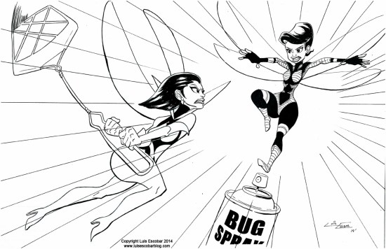
This week, Wasp (Marvel) vs. Bumblebee (DC).  This Superhero vs. Superhero fight is fought by the two women in their respective superhero universes that shrink  down and fly around like a bug.

I never really understood why this was a great super power to have. I just seems like one good smack, and it’s game over.

This drawing was ended up being more difficult to draw than I thought. Mostly because Wasp’s pose was so hard to get right.  And the angle of her head was really hard to draw.

It also didn’t help that the Pentel Pocket Brush Pen I was using is still over saturated with ink. I think I’m going to need to use a different one from now on.

I used a combination of Microns and different brush pens to get this drawing right.  All the preliminary drawing was done digitally and printed out in non-photo blue before being hand inked.

That said, I was really unhappy with Bumblebee’s right hand (the one closest to Wasp) after I had finished inking. Once I scanned in the drawing I redrew it digitally.

Share this:

  • Share
  • Click to share on Facebook (Opens in new window)
  • Click to share on Twitter (Opens in new window)
  • Click to share on Pinterest (Opens in new window)
  • Click to share on Tumblr (Opens in new window)
  • Click to share on Reddit (Opens in new window)

Like this:

Like Loading...

Tags: Superhero vs Superhero, Superheroes
Comments Off on Wasp vs. Bumblebee

Magneto vs. Dr. Polaris

November 20, 2014 in ART, SUPERHEROES

SUPERHEROES/ART- Magneto vs. Dr. Polaris

Magneto vs Dr Polaris

This week’s Superhero vs Superhero drawing gave me a lot of trouble. Seeing it, you wouldn’t think it did.

This is Magneto (Marvel) vs Dr. Polaris (DC).   They’re both the “masters of magnetism,” of their respective universes. And of course they’re now chibi refrigerator magnets holding up a drawing my son Ambrose drew when he was two.

The reason this drawing gave a me trouble was because of the lack of real planning.

The first time around I roughed it out and showed it to my wife to see if the joke “read.” I had drawn the two characters their actual size, hanging off a refrigerator.  The problem  was, they were so big, they covered up the fridge and my wife didn’t realize they were magnets.  They just looked like they were floating in a kitchen, in front of a fridge.

I scrapped the idea and simply wasn’t going to do it. I drew the Human Torch vs Fire drawing I posted last week instead.

Then I talked about it with a friend who gave me the idea to make them chibi style magnets.  That’s what I ended up doing.

Thing is, then I got ambitious. I decided I should digitally paint this drawing and not simply ink it. And by “paint,” I meant, not just color but get rid of all the lines and do a full painting.  They’re simple characters, I thought it shouldn’t be a problem.

So I began the process, and quickly realized  two things, one, I couldn’t paint all that well, and two, painting the drawing was going to take WAY too long.

So I quit.  It left me feeling really frustrated and I felt, I’d failed. On top of that, I seemed I wasted a lot of time I need to get other things done.

I had roughed out and cleaned up the drawing digitally. The line work was pretty much done.  Only, I didn’t like it.  I wasn’t sure what to do, but I ended up turning the clean up lines into non-photo blue and printed it out  so I could ink it by hand. Which I did.

And then I had a fight with my Pentel Pocket Brush Pens because the ink was too saturated and wouldn’t let me make subtle lines.  I ended experimenting with a Zebra WF1 Scientific Brush (Small Size) which worked alright. Although,  I think I still like the Tombow Fude Brush Pen I used last week more.

So in the end this simple drawing gave me more trouble than I wanted it to and it left me wanting to paint.  Which I think I”ll start doing soon.

Share this:

  • Share
  • Click to share on Facebook (Opens in new window)
  • Click to share on Twitter (Opens in new window)
  • Click to share on Pinterest (Opens in new window)
  • Click to share on Tumblr (Opens in new window)
  • Click to share on Reddit (Opens in new window)

Like this:

Like Loading...

Tags: Superhero vs Superhero
Comments Off on Magneto vs. Dr. Polaris

Human Torch vs. Fire

November 13, 2014 in ART, SUPERHEROES

SUPERHEROES/ART- Human Torch vs. Fire

Human Torch vs Fire


This time on Superhero vs. Superhero we have Johnny Storm, The Human Torch (Marvel) vs. Fire (DC).  Both of them turn on fire powers which make them both become beings of fire.  Which of course, would set off the fire sprinklers anywhere they went.

Not much more to tell about this drawing.  You can read more about each character by clicking the hyperlink for each person.

This drawing was done in my usual way of roughing it out digitally in non photo blue, but the inking was done a little differently.  I found the Pentel Pocket Brush Pens  I was using was producing too much ink.  The brush was so saturated I couldn’t draw thin subtle lines. I picked up a Tombow Fude Brush Pen and used that instead.  The flames on Johnny and Fire where done with the pen, as well as many other subtle details.  It’s really a good pen. I’m going to have to use it more often.

Share this:

  • Share
  • Click to share on Facebook (Opens in new window)
  • Click to share on Twitter (Opens in new window)
  • Click to share on Pinterest (Opens in new window)
  • Click to share on Tumblr (Opens in new window)
  • Click to share on Reddit (Opens in new window)

Like this:

Like Loading...

Tags: Superhero vs Superhero
2 Comments »

The Vision vs. Red Tornado

November 6, 2014 in ART, SUPERHEROES

SUPERHEROES/ART – The Vision vs. Red Tornado

Vision vs Red Tornado


The Vision (Marvel) vs. Red Tornado (DC)  this week on Superhero vs Superhero.

I didn’t realize how much these guys had in common visually until I started drawing them.   I had them fight because they’re both android that were created by a bad guy,  to fight good guys, but they both turned into heroes instead.

They’re only different because they don’t share the same powers.

But then I started drawing them and they both have Dracula capes, and the capes are attached by a cord.  They also both have nobs for ears and no pupils.The rest of their look is different but when drawing those three things, it really felt so similar.

If you want to read more about each character click the hyperlink above.

I did some experimenting with the inks this time around.  I started as normal. I roughed out the drawing digitally in Photoshop, and printed a non-photo blue version which I inked over.

This time I inked all the figures using a Micron Pen.  I then went in and used a Special Black Copic Marker
for the blacks.  The background was done using a N4 Copic grey marker. And finally I went in with a Pentel Pocket Brush Pen and thickened up the lines on the androids.

I wasn’t really sure how it would turn out.  It’s not bad. It was a fun experiment.  Next time though, I’ll need to design the reflective light to be more interesting.

If you like my artwork, you can download my sketchbook for free by signing up to my Newsletter. I’ve mostly been talking about superhero news there lately.


Share this:

  • Share
  • Click to share on Facebook (Opens in new window)
  • Click to share on Twitter (Opens in new window)
  • Click to share on Pinterest (Opens in new window)
  • Click to share on Tumblr (Opens in new window)
  • Click to share on Reddit (Opens in new window)

Like this:

Like Loading...

Tags: DC, Marvel, Superhero vs Superhero
Comments Off on The Vision vs. Red Tornado

Flash vs. Quicksilver

October 30, 2014 in ART, SUPERHEROES

SUPERHEROES/ART – Flash vs. Quicksilver

Flash vs Quicksilver


This week’s Superhero vs. Superhero pits The Flash (DC) vs. Quicksilver (Marvel).  Both have the power of super speed.  Who is the fastest delivery man alive?

Quicksilver is a mutant and is part of the X-Men universe.

For more info on each character, click the hyperlinks above.

I wanted to draw this mostly because I’ve really been enjoying the Flash TV show.  It’s  a lot of fun.

That said, Quicksilver has made his appearance in the feature film X-Men: Days of Future Past, and will also be appearing in the movie Avengers: Age of Ultron.

Once again, I drew the preliminary rough drawing in non-photo blue, on the computer, printed it out and inked it by hand.  The only thing I didn’t do by hand is the lettering, which I printed out black when I printed the drawing out to ink.

I mostly used the Pentel Pocket Brush Pen, and for the background a Pentel Standard Brush Pen. But I also used a Micron Pen to ink the details of the character’s faces.

Share this:

  • Share
  • Click to share on Facebook (Opens in new window)
  • Click to share on Twitter (Opens in new window)
  • Click to share on Pinterest (Opens in new window)
  • Click to share on Tumblr (Opens in new window)
  • Click to share on Reddit (Opens in new window)

Like this:

Like Loading...

Tags: Superhero vs Superhero
Comments Off on Flash vs. Quicksilver

Red Skull vs. Black Mask

October 23, 2014 in ART, SUPERHEROES

SUPERHEROES/ART -Red Skull vs. Black Mask

Red Skull vs Black Mask


In this Superhero vs. Superhero drawing, we have Red Skull (Marvel) vs. Black Mask (DC.) Both characters are villains with skull faces.  But unlike the Ghost Rider vs. Atomic Skull drawing from a few weeks back, they’re heads aren’t on fire.

Since this post is being published in October, I thought I’d make a Halloween themed drawing.  The other theme here is avarice.

In case you weren’t aware, Red Skull is a Captain America villain and Black Mask is a Batman villain. Learn more about them by click the hyperlinks above.

I drew this my usual way, by roughing it out on the computer in non-photo blue, printing it out and then inking it with a Pentel Pocket Brush Pen  for the characters, and a Pentel Standard Brush Pen with grey ink for the background.

I rushed this drawing’s rough. By the when I got to the inking stage I was really unhappy with what I had drawn so I did a lot of redrawing over the print out before I inked it.

I finished inking this at an automotive shop, while my car got an oil change.  That was new.

Even after I was done I wasn’t satisfied and ended up redrawing Black Mask’s face in Photoshop, after the fact.  This drawing gave me a lot of trouble, but I learned a lot doing it.

Share this:

  • Share
  • Click to share on Facebook (Opens in new window)
  • Click to share on Twitter (Opens in new window)
  • Click to share on Pinterest (Opens in new window)
  • Click to share on Tumblr (Opens in new window)
  • Click to share on Reddit (Opens in new window)

Like this:

Like Loading...

Tags: Marvel vs DC, Superhero vs Superhero
Comments Off on Red Skull vs. Black Mask

« Older Entries
Newer Entries »

Hi, Welcome!

This blog is your window into the daily life of a Simpsons artist. See what it's like work on a hit TV show!

I update this blog once a week, on Thursdays and (sometimes) Fridays. If you don't see anything new, just check back on one of those days.

My e-mail is: luis(at)luisescobarblog(dot)com

Both my books are now on Amazon. Pick up your own print copy today!

Buy My Art

  • Archie #1 Original on of a kind Sketch Cover Archie #1 Original on of a kind Sketch Cover $20.00
  • Deadpool's Secret Wars #1 original, on of a kind Sketch Cover Deadpool's Secret Wars #1 original, on of a kind Sketch Cover $20.00
  • Batman '66 One of a kind Sketch Cover Batman '66 One of a kind Sketch Cover $20.00

Most Read Posts

  • No results available

Featured Post

  • Using the Perspective Tool in Clip Studio Paint
  • Sketchbook Tour 04
  • Postcard Giveaway, Knowing When You Plateau, And More Patreon Rewards Dec 2018
  • Sell Your Soul: How to Build Your Creative Career Book Review
  • Real Artists Don’t Starve Book Review

Archives

Blogroll

  • Aimee's Site
  • Alex Ruiz
  • All Art Career
  • Catholic Cartoon Blog
  • Catholics Next Door
  • El Muerto Comic
  • Eric Canete's blog
  • Eternal Revolution blog
  • Fr. Roderick's blog
  • Grasiela Rodriquez
  • Haute Macabre
  • Javier Hernandez's blog
  • Jim Lujan
  • Jose Lopez
  • Lance's Blog
  • Larry Whitakers
  • Man Versus Art
  • Marcelo Vignali's Blog
  • Maria's blog
  • Mischa's Blog
  • My Deviant Art gallery page
  • My Deviant Art Page
  • My Sisters' blog
  • My wife's blog
  • Paul Wee's Blog
  • Raul Aguirre's site
  • Richie Chavez
  • Rosary Army
  • Sam Nielson
  • Shane's blog
  • Simpsons Collectionary
  • SQPN
  • Sr. Anne's blog
  • The Drawing Website
  • Thomas Perkins
  • Tommy Tejeda
May 2025
M T W T F S S
 1234
567891011
12131415161718
19202122232425
262728293031  
« Dec    
  • Top


Luis' Illustrated Blog is proudly powered by WordPress. WordPress Themes X2 developed by ThemeKraft.
%d