Baby Luke’s birthday! Back on show 500 again. More painting practice.
September 1, 2011 in ART, FAMILY, THE SIMPSONS NEWS
THE SIMPSONS NEWS
I worked Sunday for four hour this weekend. Monday, Tuesday and Wednesday I worked twelve hour days. Why? Because I’m not coming into work on Thursday and Friday. I’ll tell you why in a moment.
Since I worked so much early in the week, I managed to get all my work done for the episode I was working on by the end of Tuesday. This left me open to work on yet another episode. Seems there where some new rewrites for episode 500. A few more scenes where added and the director of the show wanted me to take a crack at them. The section seemed simple but it was deceptively hard. I did the most amount of work I could get done in the twelve hours I had. Tough Wednesday.
FAMILY
Why am I not coming into to work today (Thursday, Sep 1st.)? Well, I hadn’t really announced it on this blog. I least I don’t think I have, BUT, my wife Alesha has been pregnant all this time and she’s having the baby today (scheduled C-section).
Today will be the birthday of my son Luke Raphael Escobar! I’m so excited!
ART
I’ve continued to practice my painting these last few days. I’ve made a conscious decision to try to paint slightly more difficult subjects. Subjects whose lighting is a bit more tricky to paint. I was trying to build up to painting a pretty girl.
My first attempt was a painting of Bruce Lee. I picked it because it didn’t really have really black shadows. I was mostly dark grey and light grey tones. I find these types of values much more difficult to control. This is what I ended up with:

Yeah, what’s up with the crazy chin?! Bruce Lee FAIL.
Well, here’s what went wrong: When I was doing the under drawing, I thought that perhaps I’d caricature the drawing, but I didn’t completely commit to the idea and I ended up with a really disproportionate drawing. I didn’t really realize it until it was too late. Serves me right for rushing the preliminary steps.
Unhappy with the result, I tried it again, this time trying to just do a straight drawing with not exaggeration. Once I had that done I thought I’d experiment with the painting approach. Since the reference was mostly dark grey, I thought perhaps I should start by putting the dark grey down first and put the black in after:

I quickly abandoned the painting. I found I couldn’t put in the detail needed in the dark areas because I’d painted over my line drawing with grey. It actually was not very helpful to work this way (that, and the eyes where a bit too far apart).
I went at it again a third time. This time, I tried to get the likeness right and I approached the painting as I had been taught to do. This was the result:

Much better. I could live with it.
Next I tried drawing G.K. Chesterton. Mostly because I really like the guy. The photo I used had a lot of dark grey tones in the face so it was very challenging:

It came out okay but there’s something about it I’m not very happy with. Maybe because I didn’t get the likeness quite right, I don’t know. It’s one of those pieces where my ambition for the painting and what I eventually painted don’t quite match.
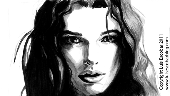
The moment of truth arrived. I was going to draw a pretty girl’s face. I looked online for a head shot of a pretty girl that had lighting I thought I could work with. I found one of Keira Knightley I thought would be good and proceeded to paint it:

…and had an EPIC FAIL.
I knew going in that the best approach for painting a pretty girl is, “less is more”. The reference I was using had a lot of light grey tone in it. I had the painting at a certain degree of finish and I though I’d try maybe putting in a little light grey tone. Unfortunately it was a tad too dark and there’s no “undo” button on a practical painting. I tried to “save” the painting by making the dark grey areas darker to make the light grey look lighter. It only made things worse.
Well, having learned from my mistakes I tried it again. This time I took the “less is more” approach:

It turned out okay but somehow I thought it didn’t look finished. I still wanted to add some value to light areas so it didn’t look so washed out. But I didn’t want to screw it up. I scanned the painting so I could at least have a copy of what it looked like before I added the light grey and then went ahead and applied the light grey:

I don’t really think it looks any better. I think it looks worse. Too many brushstrokes. It makes her look old.
Still, I’m learning. I’ll need to practice this some more. I don’t have the hang of this painting thing yet but I’m getting there. Next time I’m going to pre-plan the rhythms on the face a bit better. That way, the strokes I put down better define the planes and aren’t so muddy.
Perhaps, next week, I’ll start working on the roughs for the cover for my wife’s book again.
For more comic and stories written by me, CLICK HERE.
If you like what you read, please consider signing up to my rss feed.
Comments are appreciated as well.
I also have a store. Click Here and check it out.
If you would like to have a text ad on my site, click on the red BUY LINKS button under the Archives list.
And while you’re at it, please Digg me too.
Writing this blog is almost a part time job for me. Tips are most welcome.


